We are in unprecedented times. The spring term has been a time of triage, of doing what we can to meet students and create any learning experience possible. Many have used our learning management system, Moodle, for the first time (Kudos!) And some are relying on it just a bit more than they have before. According to data being collected by colleagues in the Office of Research Administration, student experience in this new paradigm within Moodle has varied. Some have been able to take it in stride and some have experienced challenges. The purpose of this post is to provide brief design examples and recommendations that an instructor may implement in their Moodle course to help make the student experience as good as it can be.
As an aside I will mention that Shannon Newman and I presented a workshop where we shared strategies for making a course more inclusive with Moodle tools. You may see the slides here.
What follows are some strategies with examples that you may choose to implement in your Moodle course(s).
Strategy 1 – Use Topic Zero With Care
The first topic section in every Moodle course is “Topic 0.” One special characteristic of this section is that it is always visible no matter which course format you choose.
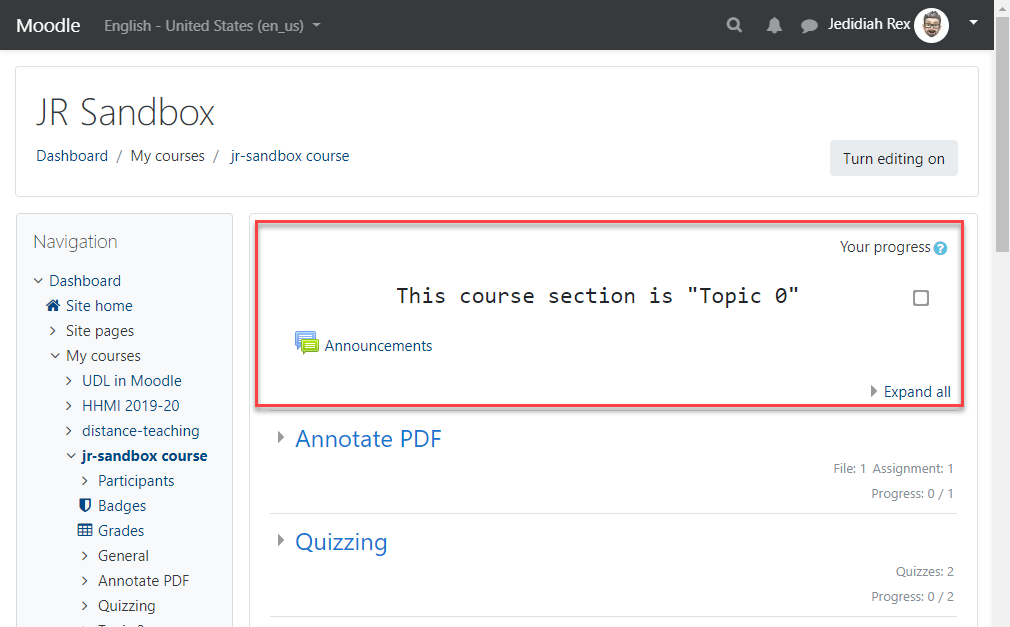
This makes it a great place for more static information like a syllabus, office hours, and course description. Care should be taken to only place what is necessary in this section. Keeping the information in this section concise will limit how much the students have to scroll to access other course materials.
Strategy 2 – Use images
Images can bring color and increase interest on your course page. While cliché, there is some merit to the phrase, “A picture is worth 1000 words.” Used in the right way, an image can additionally help bring clarity to a concept or provide commentary on a specific idea. Below (1) is an example of a banner image from Martyn Smith’s RLST 205 course, “Religion and the Biosphere.” The image adds interest and is tied to the course theme.
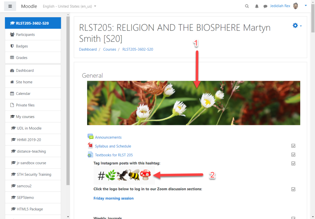
The second image (2) is used to convey information to the students about how they can interact in the course.
One note on using images: Best practice would dictate that all images be accessible, containing alternative text (alt text) where necessary. The Moodle text editor provides you direction for entering alt text and/or giving you the option to not include it if the image is decorative. In the above example the banner image is most likely decorative and doesn’t need alt text. The second image would require a description to allow those using screen reading software to know what the image was about.
Strategy 3 – Limit Cognitive Load
Limiting the amount of content that students must consume in an interaction with your course can open mental bandwidth for them to focus on the course content and work that you have for them. There are a number of ways that you can support students in this. One way exampled in both Martyn Smith’s RLST 205 and Shannon Newman’s BIOL 354 course, is that only the most current week/topic (RLST 205,) or all past and current are visible, but future topics are hidden (BIOL 354). Topic sections may easily be hidden by the instructor.
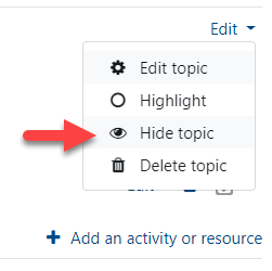
Activities and resources may also be hidden/shown to students based on a number of criteria including date, grade, completion of another activity or combination thereof.
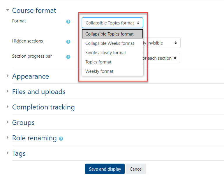
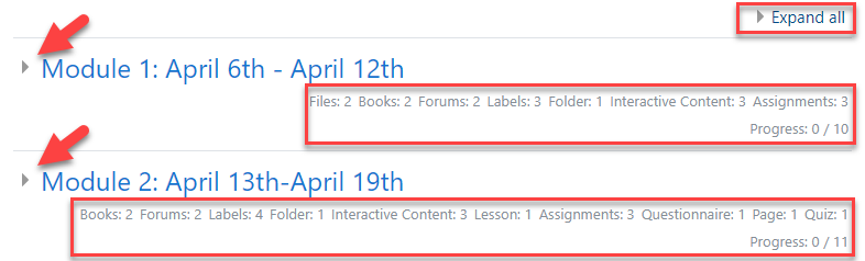
Another way to help focus students’ attention is to use an alternative course format. Two useful ones are collapsible topics or weeks. They function as they sound, allowing each topic to be collapsed or expanded as the student needs or desires.
We can see an example of this in the image below from Shannon Newman’s Molecular Biology course. There is an option to expand all sections in the upper right. Each section contains an arrow on the left to expand or collapse that section. Two benefits of this format are that 1) it provides a list of the activities and resources contained in that section, and 2) shows a progress counter so that students can see how much they have completed in a section. This supports their executive function.
One last way to limit cognitive overload is to group information within a Book, Page, or Folder resource. Each of these provide a way to consolidate large amounts of information or files into a single link on the course page.
Strategy 4 – Use Consistent Organization & Visual Design
A Moodle course is an extension of the class environment and in this current circumstance THE class environment. An instructor can provide context for the course materials which will in turn help students navigate, locate, and use those course materials. This is accomplished by using a consistent layout and visual design. An example of this can be seen in Shannon Newman’s Molecular Biology course.
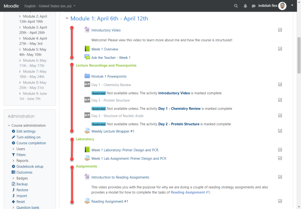
In the image above we see four distinct sections within the topic section: an overview, Lecture Recordings and PowerPoints, Laboratory, and Assignments. Each of the subsequent sections in Shannon’s course follow this same format. Doing so provides a consistent structure to help the students find what they need. Creating sub-sections within a topic section can be accomplished by using a Label resource to create a heading and then indenting (“Move right”) the items below the heading.
Where the section structure may differ from topic to topic with additional or less materials, e.g. there is an additional section for “Exam Information” in the second module of Shannon’s course, the order is kept consistent to allow the students to easily scan over the materials and find what they need.
Strategy 5 – Avoid the Scroll-of-Death
Moodle makes it very easy to add materials to a course. It is simple as dragging them from your computer’s desktop or folder into your Moodle course. As a result a course can end up consisting of a long list of documents and activities requiring students to scroll and scroll to see materials later on in a course.
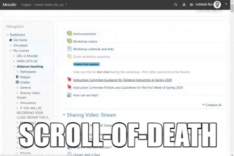
A number of the strategies mentioned above may help combat this (Collapsible topics/weeks, hiding topic sections, using Book, Page, or Folder resources.) Making an effort to limit scrolling is especially important as more and more users access Moodle from a mobile device. By way of illustration during the first four weeks of winter term 41% of users accessed Moodle from a mobile device. During the first four weeks of spring term this number has increased to 53%. Ignoring this trend means creating barriers for users and creating a less inclusive environment.
Using the handful of strategies presented can help make your course more accessible, pleasant, and useful to students. The easier it is for your students to navigate your Moodle course the more they can concentrate on the task of learning. Please reach out to Instructional Technology if you have any questions about the strategies shared here.