Canvas: Pages Plus

I had the opportunity to facilitate a workshop focused on a couple more advanced page editing options. We investigated how to create responsive tiles and creating tabbed pages. The purpose of these options is to create a visually engaging, responsive, and accessible page. The code to create tabs is based on what I found on this page. The code to create the responsive tiles was created through experimentation based on information gathered across many pages and forums.
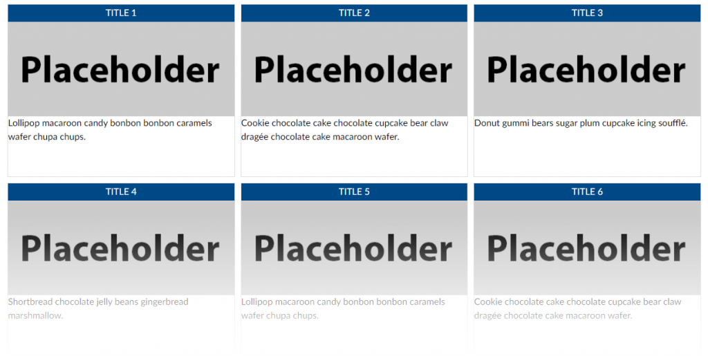
Six rectangular tiles arranged in two rows of three. Each has a title with white text and blue background. Below each title is a grey card containing the text "Placeholder." This is followed by filler text.
Tile/Button example.
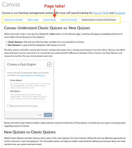
A Canvas Page containing tabs for different content on each tab.
Tabbed page example.

Code Examples

A snippet of the tiles HTML code for the tiles/buttons is below. I have separated each element with a line break to see each more clearly. This is followed by an explanation of what each piece is doing.

<div id="container">

    <div id="button1" style="width: 32%; height: 300px; float: left; min-width: 300px; margin-right: 10px; margin-bottom: 10px; padding: 0px; border: 1px solid #dddddd;">

        <h2 style="width: 100%; background-color: #004987; margin: 0px; padding: 3px 0px; font-size: 1em; text-align: center; color: #ffffff;">TITLE 1</h2>

		<p style="margin: 0px; padding: 0px;"><img id="315178" style="width: 100%; display: block; margin-left: auto; margin-right: auto;" src="https://lawrence.instructure.com/courses/3249/files/315178/preview" alt="placeholder_360x150.png" data-api-endpoint="https://lawrence.instructure.com/api/v1/courses/3249/files/315178" data-api-returntype="File" /></p>
      
		<p style="margin: 0px; padding: 0px;">Lollipop macaroon candy bonbon bonbon caramels wafer chupa chups.</p>
	</div>

 </div>

The first div serves as a container for all of the tiles or buttons, which are each their own div. The id allows us to give each div a name as a reminder of its function.

Each tile or button uses the same structure:
div – an opening div tag to define the button structure.
h2 – a heading to contain the button title.
p – a paragraph to contain an image.
p – a paragraph to contain a link and/or description for the button destination.
div – a closing div tag.

The width of the div is set as a percentage of the total page width. You can change this based on how many buttons you want to be tiled horizontally based on the overall page width. You can edit the height as you need/want. The min-width, margin-right, and margin-bottom allow the divs to tile correctly as the page becomes smaller (or on mobile). I recommend leaving these as they are. You can elimiate the border if you want by setting the width to “0px”. You can also change the color of the border if you want by entering a different HEX color code.

The h2 creates a heading for the button. You can remove this line if you do not want it. You can edit the background and/or text color by changing the HEX color code for the “background-color” and/or “color” element.

The first paragraph tag contains the button image. The “p style” allows the full image to be displayed without any space between it and the h2 heading. The image styling (display: block; margin-left: auto; margin-right: auto;) centers the image in the paragraph.

This last paragraph contains the link to a page or other course element. The “text-align: center” style centers the text in the paragraph.

These are followed by each of the closing div tags.

Let’s turn to the tabbed pages. Here is the code:

<div class="enhanceable_content tabs">

<ul>
<li><a href="#fragment-1">PUT TITLE FOR TAB HERE</a></li>
<li><a href="#fragment-2">PUT TITLE FOR TAB HERE</a></li>
<li><a href="#fragment-3">PUT TITLE FOR TAB HERE</a></li>
</ul>


<div id="fragment-1">PUT THE CONTENT FOR THE FIRST TAB HERE</div>
<div id="fragment-2">PUT THE CONTENT FOR THE SECOND TAB HERE.</div>
<div id="fragment-3">PUT THE CONTENT FOR THE THIRD TAB HERE</div>

</div>

Make sure to edit the tab titles in HTML mode and not in the rich content editor. Doing the latter may introduce display issues with your page. You can add more tabs by copying and renaming each list (li) item. Make sure you copy from the opening li tag through the closing li tag. You will also need to make sure to add a corresponding content area.

Recommended workflow – create separate pages in Canvas for each tab content. Once the individual page is complete, copy the HTML from that page into the “PUT THE CONTENT FOR THE NTH TAB HERE” location. This will allow you the flexibility of more easily working in the rich content editor with the content and preserve the page structure within this code

Resources

Text files and placeholder images may be found in this folder.
Making Accessible Office Documents

One part of creating an inclusive classroom is making sure that the materials we use are accessible to those with disabilities. As the University of Washington Accessible Technology blog points out, there are some common steps that one can take regardless of the type of document. These include:1

  • Using headings
  • Using lists
  • Using meaningful hyperlinks
  • Adding alternate text to images
  • Using tables wisely

I will include links below to helpful resources for each of the three Office tools. This link to the University of Washington page on creating accessible documents contain very helpful information. There is also a link to Microsoft’s accessibility video training hub that has helpful information and examples.

Word

PowerPoint

Excel

References

1. “Overview of Accessible Documents.” n.d. Accessible Technology (blog). Accessed February 20, 2020. https://www.washington.edu/accessibility/documents/overview/.

ID2ID: Professional Development Event Synopsis 2

As a means of supporting our growth and knowledge in the area of universal design for learning and inclusive course design, over the last my ID2ID colleague and I read and discussed the book, Supporting College and University Students with Invisible Disabilities by Christy Oslund as our second part of the professional development requirement.

We both enjoyed the book and found it helpful in our practice. The book opens by dispelling myths and then sharing about the legalities around meeting the needs of those with a disability. The next five chapters were most useful, helpful, and illuminating for us as each shared a different invisible disability. These chapters included background information, co morbid disorders and support recommendations for each disability. These chapters helped to illuminate the challenges that those with each disability face and tangible recommendations for supporting those with a particular disability. The last few chapters launched into a discussion around universal design, universal design for learning, and consideration for administration. While informative my colleague and I did not find this section to be as helpful as the last. The recommendations here were a bit too general to be helpful.

In my work at Lawrence University this work will be a great resource for instructors helping them to better understand the students they teach. As we embark on a journey toward inclusive excellence the information in this book will help instructors exercise compassion toward students with a particular disability as well as have a better understanding of the legalities around disability. we plan to use this book in a faculty reading/discussion group in a near future term.

“UDL: Unplugged” Workshop

RESCHEDULED!

Calendar planner.The workshop has been rescheduled for Thursday March 14th, 9:30-11:00 AM

Please RSVP via this form if you would like to attend the workshop.


One possible criticism of the universal design for learning (UDL) framework is that it requires the use of technology. In the spirit of LU Unplugged, we will be working together to identify strategies based on the UDL framework that do not require the use of technology.

Resources

If you are interested in learning more about UDL please visit the following resources:

On the Web

Books

Transcription

An image of a text chat bubble.One common question that I receive is, “How can I transcribe this audio or video file?” Providing transcriptions for media make them more accessible and searchable. The list below offers some options that I have gathered over the years.

Automated Services

These use machine learning to produce the transcript.

  • Trint.com – $15/hr. (they offer a 30 min free trial)
  • Temi.com – $6/hr. (free trial available)
  • Spext – $21/hr. (they offer a 30 min free trial)

    Manual services

These transcriptions are done by a human.

  • Fiverr – This service allows you to post a job and someone will freelance. Quality and cost will vary.
  • Upwork – This service allows you to post a job and someone will freelance. Quality and cost will vary.
  • Rev.com – $60/hour. Most expensive of the lot, but offers good quality, and file format options.

    One last option…

    This is a free option but ymmv (your mileage may vary). Make sure you are connected to wired internet if you try this.
    Google Voice Typing/iOS/Android Speech-to-text